Field Notes
from Hacking Accessibility
On people, perception,
and building useful tools.
Before you start
For nine whole years, I spent my life building tools for people who are blind or have low vision. People who cannot fall back on a screen as a default option. It started with an app that speaks out the visual world, followed by two generations of AI glasses, worn on real faces, in real streets. Together, these tools have reached nearly a million people.
Over the years, these people and their experiences moulded and reshaped my understanding of interaction, control and independence.
These accounts capture a selection of moments that changed how I think. The insights from them are shaping what I want to build next.
The twenty-euro note
Envision began as my design graduation work in Delft. I was trying to understand what independence meant to blind and low-vision people, and for most of them, it meant accessing information: a letter, a label, a sign. Along with my co-founder Karthik Kannan, I built rough prototypes that could pull text out of a camera image and speak it aloud.
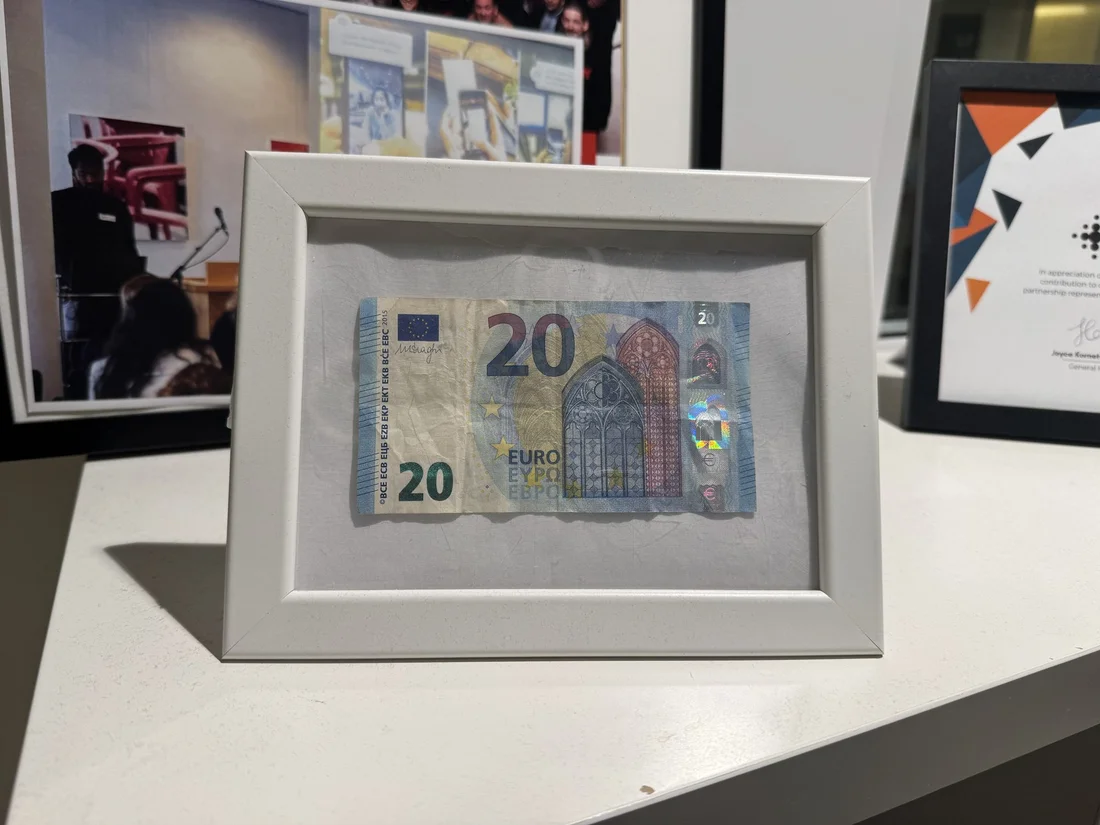
At an exhibition in the Netherlands, I showed the prototype to a woman in her sixties. After the demo, she immediately reached into her purse, took out a twenty-euro note, and shoved it into my hands. I tried to explain that she could eventually download it from the App Store, but all she wanted was for me to take the money, and give her the app on her phone right then and there.
It baffled me, because to me, it was just a prototype and I was still trying to figure out what it could become, but to her it was already a better alternative than asking someone to read her mail. When the alternatives are that bad, the bare bones of a thing can already be valuable.
That twenty-euro note is now forever framed in my office, and it has become my measure. Every feature that was considered after that had to answer one question: would someone reach into their purse to buy this immediately, even before leaving the room?
Start with the familiar
Early on, I assumed a smartphone must be hard to use without looking at the screen. Then I watched experienced blind people listen comfortably to screen readers set too fast for me to follow, and type braille with both hands on the touchscreen, faster than I could type on my own phone. There was a fluency here that I needed to understand before asking anyone to learn something new.
That became the starting point: new technology was being introduced, but the habits around it could still feel familiar.
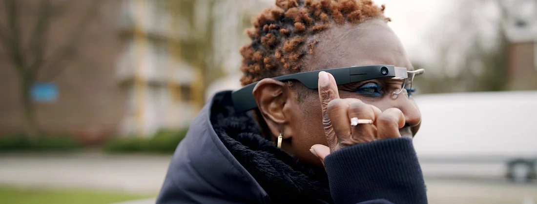
When designing a wearable, I considered a pin on the shirt, a pendant on a chain and a handheld with a small screen. But glasses fit the way people already moved through the world, with a camera that followed their attention and a speaker beside the ear.
People were already familiar with orienting their heads. When I asked someone holding a letter to move the page or their head, most moved their head, choosing the movement they trusted. And because so many of the users already wore spectacles, these could simply be glasses that did more.
That familiarity carried into the interface: a swipe moved between items and a double tap opened one, matching the screen-reader gestures they already used on their phones. A single tap would have saved a movement, sure, but a double tap was the movement they already knew. Within minutes, experienced screen-reader users were finding their way through the menus, as if the glasses were an extension of the phone in their pocket.
Start with the familiar. New technology should feel like it belongs in a life, not like a new life to learn.
"How do they look on me?"
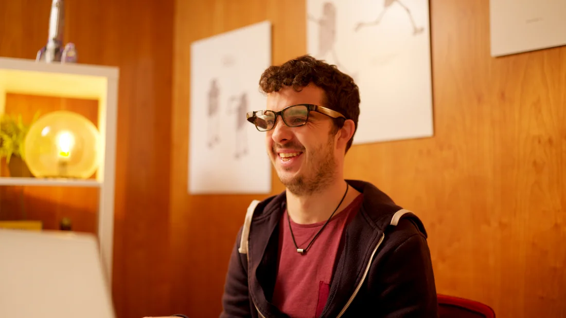
The first question people asked when they tried the glasses was not about the camera or the battery. It was "how do they look on me?"
At first, I found it surprising because I attributed this question to vanity. It stopped surprising me once I understood the stigma the users live with. Being blind in public already draws attention nobody asked for. Strangers stare. Someone takes your elbow unsolicited. A lot of people even put off the white cane for years, until there is no choice left. Most blind people choose to use a smartphone rather than a special one with physical buttons that would be easier. Why? Because everybody uses a smartphone, and they want to be just like everybody else, not "special."
One user told me, "I don't want to walk around looking like a cyborg. However useful the thing is, if it makes me stand out, I will not wear it." That is why most assistive technology devices end up in a closet.
So how the users looked in them became the north star for the hardware decision. In 2018, the most capable smart glasses were also the bulkiest, and I chose a frame under fifty grams that looked like a pair of regular glasses, despite the drawbacks: less battery, less processing, and a system that had to split its work between the glasses and the cloud to keep up.
User perception of your product is a derivative of how they think others will perceive them when they use it. So it makes sense to constrain your decisions around it, or build something so cool that it changes the perception.
Know the limits
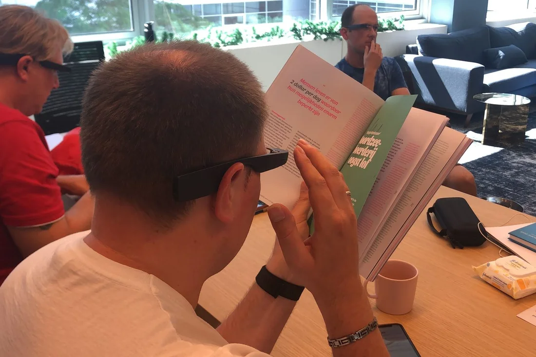
On a phone, finding a document was fairly simple. Someone placed a page on a table and held the camera above it, where a rectangle detector could find its edges and capture it for reading. When the camera moved onto the glasses, that simplicity disappeared.
Now the page was held upright, with fingers covering its edges and a room behind it. A door, a window or a poster could look like the rectangle the camera was searching for. The person was doing something perfectly natural, but the software had been built for a different view of the world. To solve this, I worked with our beta testers to collect images through the glasses and trained a custom model to recognise documents as people actually held them.
Years later, language models brought another kind of possibility, and another boundary to understand. They could describe a scene beautifully, yet stumble over a page of dense text, inventing details with the same fluency they used to describe what was there. For someone who could not look at the page to check, that confidence carried a cost.
Our text-recognition pipeline already built for reading offered a way forward. When an answer depended on a document, its words were extracted first and passed to the language model, giving the response a firmer basis in what was actually on the page. If the text could not be read, the system could ask for another capture, leaving room to acknowledge a failure instead of speaking confidently through it.
Knowing what a technology makes possible is only half the work; the other half is learning where it stops being dependable. Those boundaries became some of the most important design material.
Too much information?
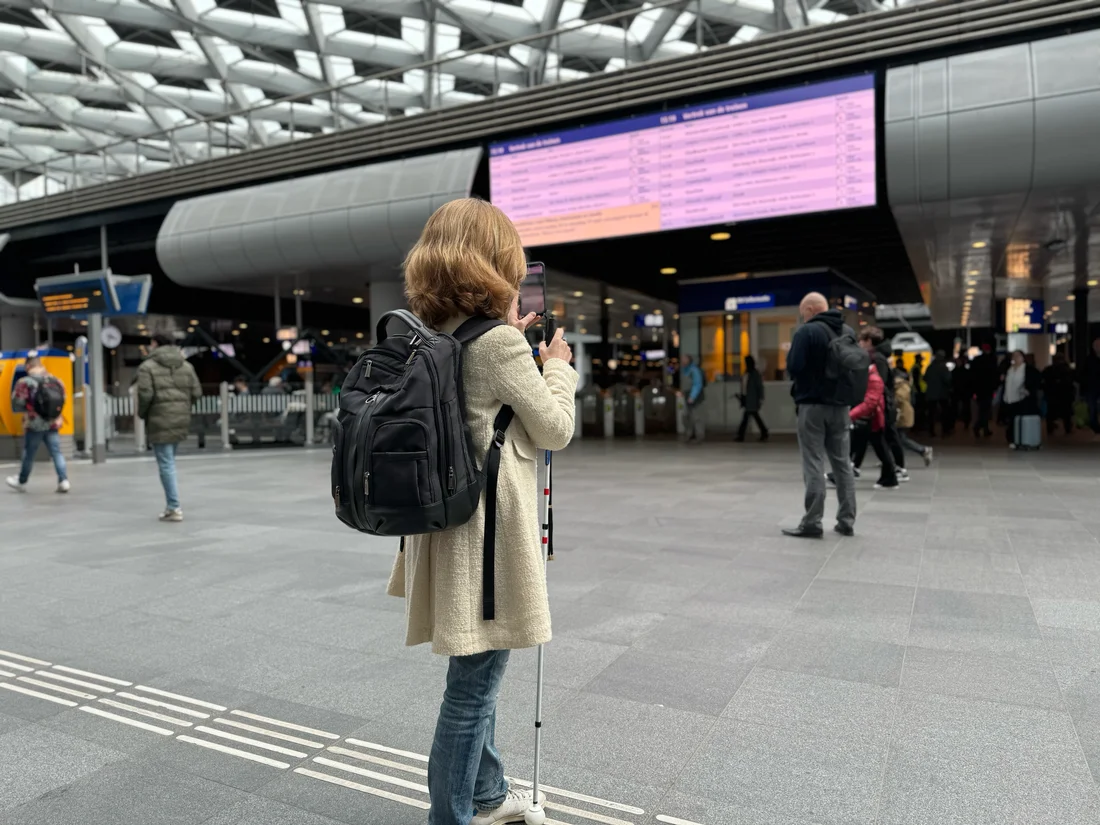
I built a feature called Instant Text that reads out every piece of text the camera sees, continuously, as the person looks around: signs, labels, adverts, menus.
I was a little worried about information overload. For instance, a train station is full of text and almost none of it is what you need. Surely the system should filter and summarise on the user's behalf.
Users disagreed. They stood on the platform, heard the shop names, the adverts, the ticket counter, and then platform number, and they picked out platform number. They brought their own intention and did the filtering themselves. They did not want to explain to the glasses what they were looking for. They wanted the world to just keep speaking to them, and for them to decide what mattered.
So I kept the stream and gave them steering: a single tap to pause or resume, and a double tap to discard whatever the glasses were still reading and capture a fresh image.
Sometimes a system should choose for people. Sometimes it should give them the raw stream and a good way to direct it. Knowing which is the whole job.
How much choice?
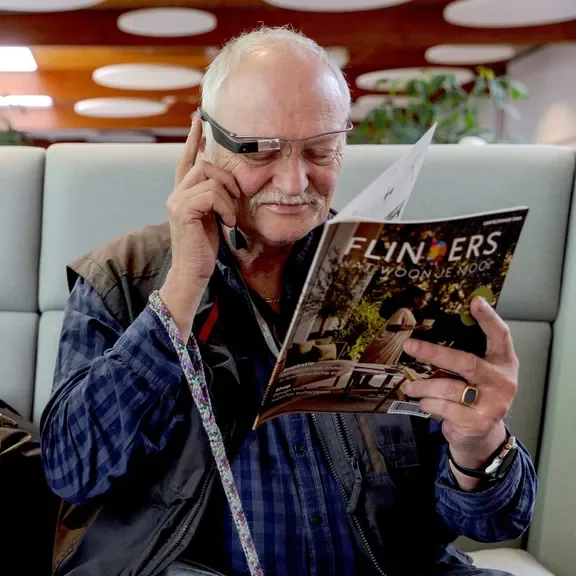
The people using Envision had very different experiences of sight. Some had been blind since birth; others were adjusting to losing their sight. Some knew every shortcut on their phone, while others were learning to use one. Even people with similar sight could want entirely different things: a rich description of everything around them, or the shortest route to an answer.
The settings page became one of the most debated parts of the app. Too little choice would force everyone into the same experience. Too much would turn a simple tool into an aircraft cockpit, asking people to master the controls before getting anywhere. Every setting had to earn its place, because each new freedom also brought another decision.
Sometimes the right choice was to make the decision disappear. If a document was upside down, the software could rotate the captured image and read it. There was no reason to announce its orientation and ask someone to turn it around. They wanted the words on the page; the software could take care of which way they faced.
Other choices belonged to the person. How much detail feels helpful is harder to decide on someone’s behalf. So people could describe the kind of response they wanted, opening a way to shape the experience through conversation. “Give me a little more context” leaves room for a preference that a toggle cannot quite hold.
I keep returning to that balance: how much should a product decide, and how much should it leave open? The settings page is where that question becomes concrete.
Adding a control is easy. Understanding whether it gives someone freedom, or simply gives them work, is the hard call designers need to make.
Confrontation or curiosity?
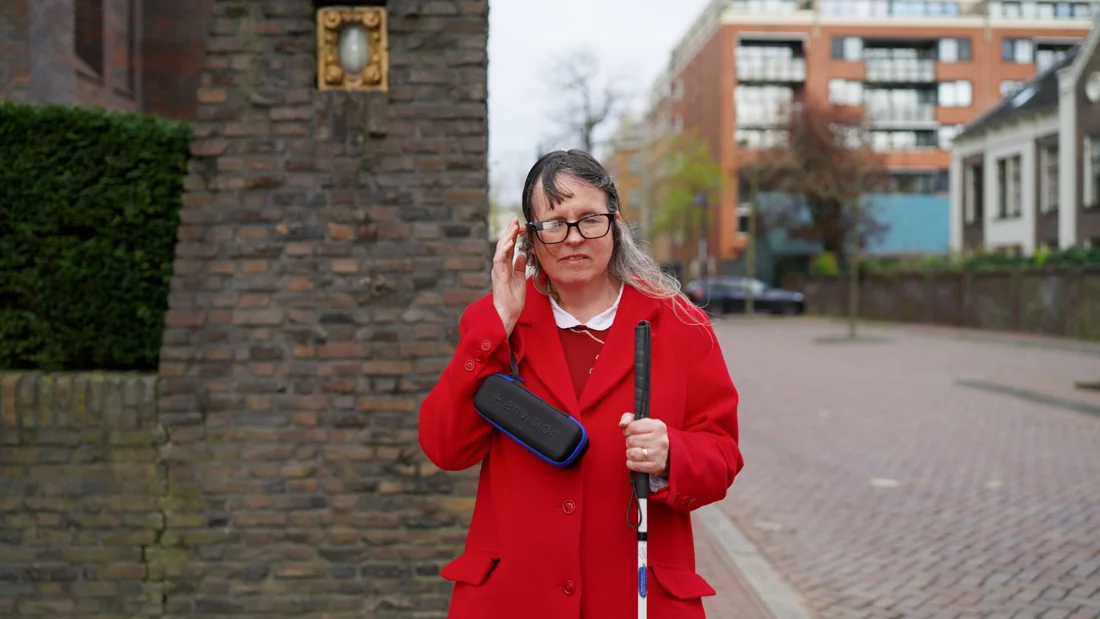
I braced for confrontation. A person walking through a supermarket with a camera on their face, pointed at whatever they turned towards. I expected someone, somewhere, to ask them to take it off.
In years of use, across thousands of users, nobody reported such a confrontation. What they reported instead was curiosity.
Strangers asked how it worked. The shop staff wanted to see. When people see the glasses together with a white cane, something different is triggered in them. The camera stops being a threat and becomes visibly a need, and the need outranks their concern about being recorded.
I take two things from this: a camera in public is not a fixed problem; it is a question of whether the person nearby can read why it is there. And people are more empathetic than we plan for. Design for the curious stranger, not only for the hostile one.
Tears of meaning
Years after the twenty-euro note incident, I received an email from the Make-A-Wish Foundation about a boy named Richard in Mississippi. He had a brain tumour and was losing his sight. Of all the things he could wish for (a trip to Paris, a chance to meet a star, some grand toy), he wanted a pair of Envision Glasses.
My heart skipped a beat. Why these glasses? I shipped a pair immediately. My team spent time with Richard and his family, helping them get started with the glasses.
Still, a part of me felt like an imposter. Could something I built genuinely be someone’s wish?
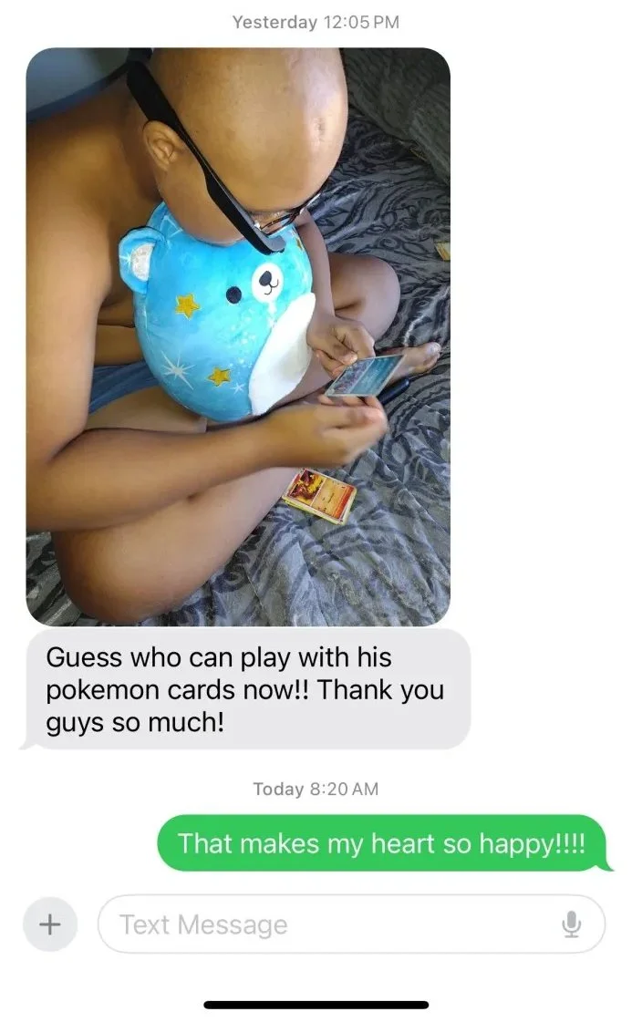
Then, a few days later, I received a photo, and in it was Richard using Envision Glasses to play with his Pokémon cards.
I broke down in tears as soon as I saw it, because, in that profound moment, every hardship, every sacrifice, every late night, every anxious day suddenly felt justified. If all the struggles led to a kid like Richard enjoying just one more afternoon of Pokémon, then every ounce of pain had meaning.
Watching him flip through Pokémon cards, I understood that I had somehow ended up building a tool that gives people something priceless: the freedom to carry on doing what they cherish most.
I often think about that photograph alongside the twenty-euro note in my office. One came when I was still discovering whether the app was even useful. And the other came after years of building, shipping, and supporting the glasses. In both moments, someone gave a very particular meaning to the work done.
When your work gives someone the chance to live just a little more fully, you’ll know: every bit of it was worth it.
The great humbling
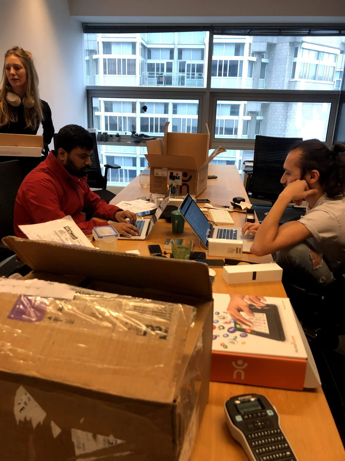
When I started Envision, I was still in college and naively optimistic in the best kind of way. People warned me that accessibility was a difficult market, hardware was hard, and figuring out insurance and reimbursements was a nightmare. But I had the audacity to say, “Why the fuck not?” and build anyway.
We were here to hack and disrupt this space, and we did so spectacularly. Within its first year, our app became the most used app amongst blind people. We partnered with giants like Google, Microsoft and Meta. When we launched our glasses, we went head-to-head with a venture-backed unicorn called OrCam and came out victorious by outselling them on a shoestring budget. We became the primary example of what disruptive tech in accessibility could look like, and we inspired a generation of companies that came after us. Above all, we built a community that loved us and rooted for us.
And then we hit a ceiling.
More features, better technology, the same ceiling. There was only so far sheer grit and determination could take us. We were serving a market that looked large on paper: 300 million blind and low-vision people worldwide. But when you peel that onion, you realise that the vast majority are dealing with far deeper challenges of poverty, unemployment and depression. When you do the math, the number of people willing to use technology in their daily lives, and actually doing so, is somewhere around a million. A number we had already hit.
It was not a sudden revelation. We had seen even low-cost and free solutions struggled to grow beyond a million users. I believed we were different, that we would somehow break through. But the macroeconomic and human realities humbled me.
That’s when I chose to pause
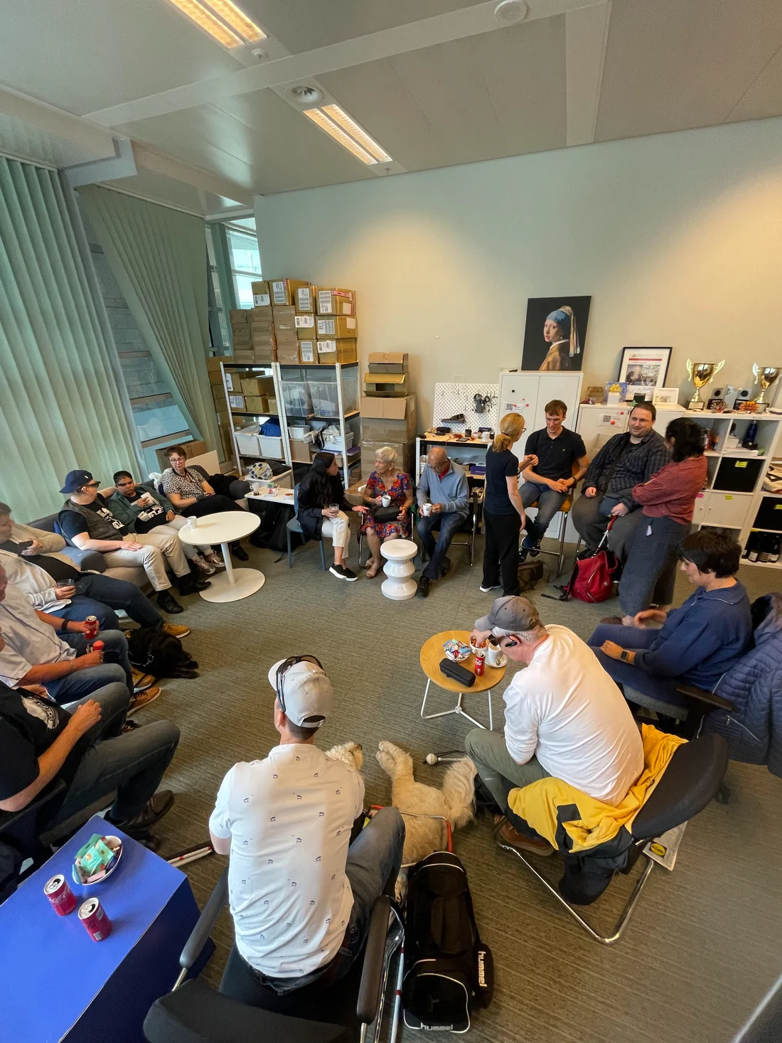
I could have spent a few more years pouring all our effort and resources into incremental growth, but the impact would never match the work. After careful deliberation, I realised I was doing the accessibility community a disservice by approaching the problem this way. I now believe the best way to build for accessibility is not to build only for accessibility, but to build truly disruptive, general-purpose technology and make sure it is accessible to everyone.
The biggest leap in accessibility for blind users in a generation probably came with the smartphone era, ushered in by the iPhone and the App Store. The iPhone wasn’t intended to be an “accessibility device”. Yet by combining a great general-purpose phone with a commitment to making it accessible to people with disabilities, Apple has had far more impact on accessibility than any dedicated accessibility device in the past century.
Now AI is opening another such moment. A new generation of everyday devices is taking shape, and with it, another chance to make accessibility part of the foundation. That is what I want to spend the next decade pioneering and shaping. Because why the fuck not?